12 Pictures That Show Facebook Design Changes Over The Years
Wednesday, Aug 26, 2020, 10:07 am
Loading...
Not feeling old yet? Check this nostalgic topic and you will understand how old you have become! Facebook was founded in 2004 by Mark Zuckerberg, who was then a 20-year-old guy. Most of you guys were in your teenage back in those days. Although people were extensively using the internet a decade back, the web technology was very naive. Like many other websites of that generation, Facebook too wasn't a feature-rich website. Hey, jump in our time machine! We will take you back in time showing how Facebook has evolved over the years!
1.Timeline
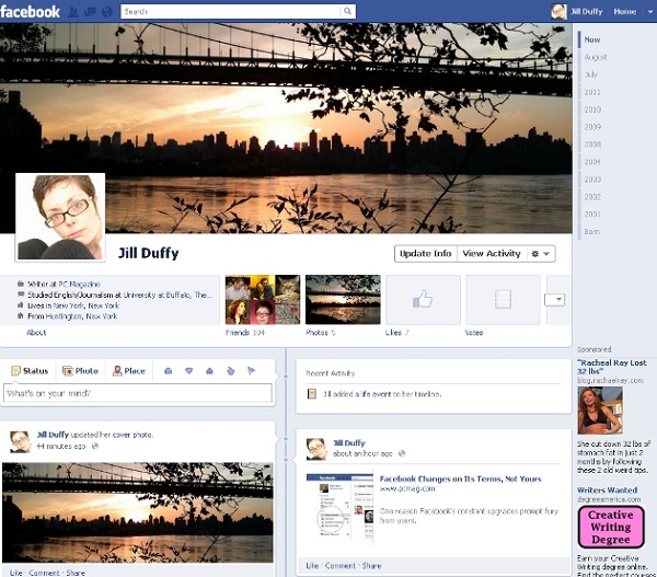
The latest change has been this layout with the timeline photograph at the top and moving around where different boxes of information appear. A lot of people did not like having that large image at the top, but at the end of the day it is not as cluttered as it used to be and is easier to move around.
2.Ticker
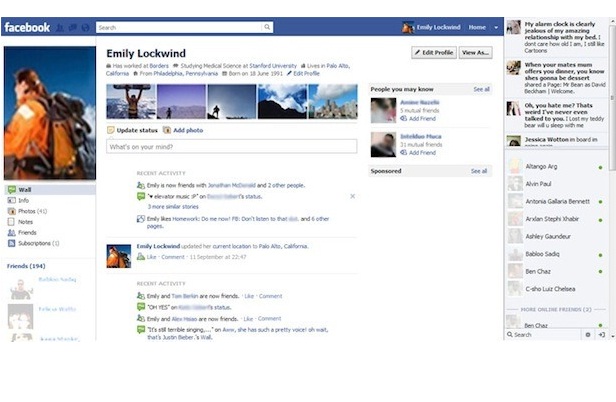
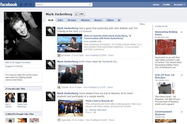
In 2011 the biggest change in the design was the introduction of the ticker feed and this is something that some people loved, but others hated. You can see that the rest of the profile has not really changed much from the previous redesign as they were merely tweaking the site in general.
3.Photo Banner
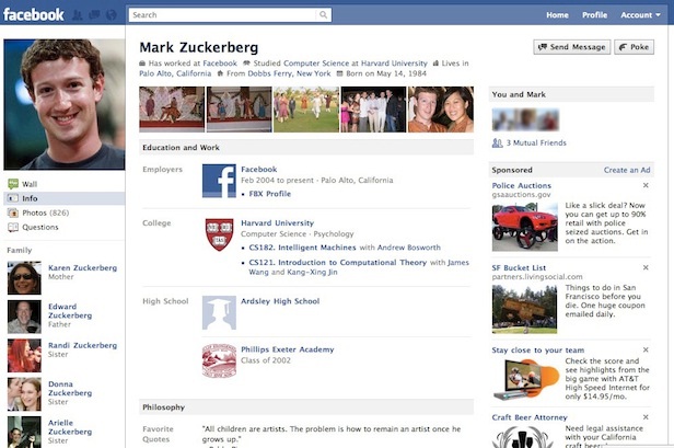
In 2010 the biggest change was the introduction of photographs at the top of the profile page and there was also just some general tidying up across the website in general. It was also the time when they started to recommend friends to you as well.
4.Personalization
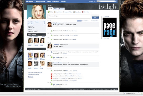
Facebook did decided to look at allowing people to personalize their pages a bit more although there were limits as to what could be done. This was focused more on allowing companies to brand themselves online resulting in some subtle changes to the main layout, but the real focus being giving them the ability to upload banners as is shown in this example.
5.Fans
In 2009 the biggest change was that people could then become fans of pages rather than friends and that did help to really push the site forward. It meant that people did not feel as restricted any longer as there was no limit to the number of fans you could have.
6.Facebook Lite
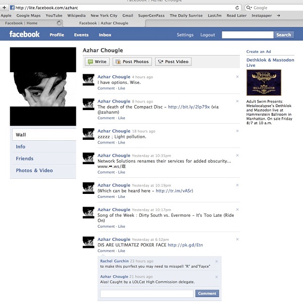
Around 2009, Facebook started to experiment with what it called Facebook Lite, which was a stripped down version of the site that would load quicker and you could see it as an attempt to improve the site on mobile phones. They took out a lot of the fancier things leaving only the basics as can be seen here.
7.2008
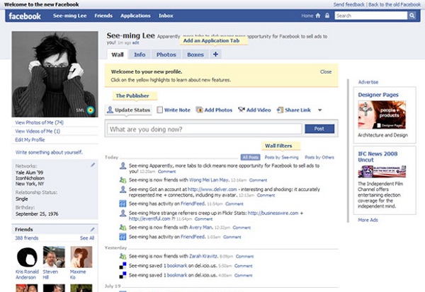
This shows a big change to the layout of Facebook as your own personal information has been pushed over to the left hand side rather than being in the middle. You can then also add various things to your profile including application tabs making your profile far more interactive.
Loading...
8.Gifts
By 2007 there had been a few small changes, but at this point it was more about boosting the ease with which you could interact on the website. They started to really introduce different applications including the ability to send each other gifts.
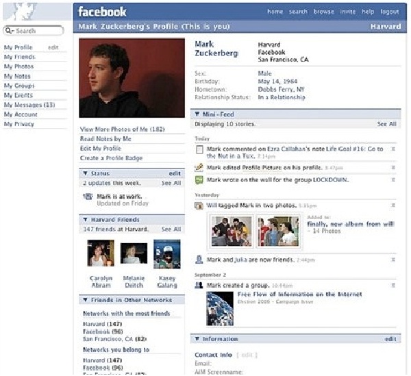
9.Mini-Feed
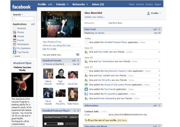
The next step was to just tidy things up a bit more and make more use of the mini-feed option on the main profile to make it easier for people to see the kind of things you were doing on the website. This was just a subtle change from the previous design, but subtle change is what you expect from Facebook.
Loading...
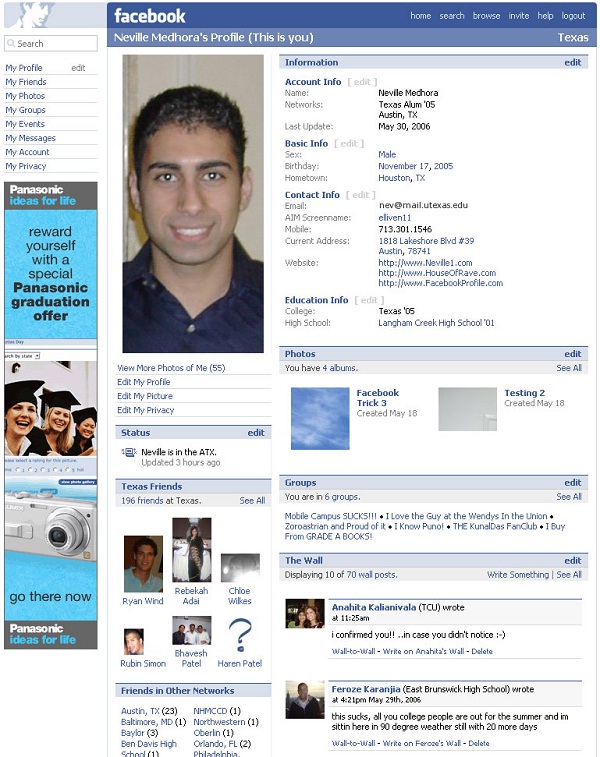
10.2005 (2)
After getting the name, Facebook, they changed around the profile a bit including making the wall more visible and generally opening it up a bit. This design does look a lot better as a result although you were still very limited as to what you were able to do with the website.
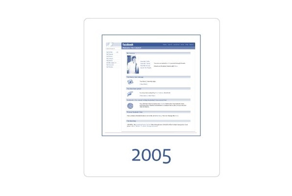
11.2005 - Accessible Only To College Students
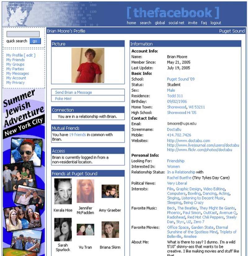
Facebook was called THEFACEBOOK.COM back then, and it was developed primarily as a social networking website for Stanford University students. Mark Zuckerberg later planned to make the website available for all the Universities in the United States and around the world. Thereafter, he made the website available for the public to use. As you can see in the picture, the early versions of the social networking website looks very simple and lacks many of the present day features including timeline, newsfeed, Pages, and even robust advertising system. Facebook has never stopped making changes to the website over the years.

12.The first
This is how Facebook looked when it was being created and it is very, very simple and pretty plain with not much to do. However, this was what you would have been using if you had been at college around that time and you do wonder how it became so popular when it looked so bad.
Report
Loading...
Related Content

