15 Hilarious Logo Fails That Make You Say WTF!
Friday, Aug 28, 2020, 9:44 am
By:Mike Litzler
Loading...
A company's or a business's identity is visually expressed through a logo. Imagine all the top firms in the world without logos? It's tough to imagine them, right? We don't deeply observe, but logos and colors impact our mind in a big way. An attractive logo grabs people's attention and helps build a positive impression of the company. So, one should never ever mess up a logo! Check these fifteen hilarious logos fails and understand how people perceive awkward and inappropriate logos and laugh at them.
1.Kudawara Pharmacy logo gone wrong..
Out of all the logos, i think this logo was intentionally made to depict something else, i mean why did the logo designer even thought of putting the heads on those images? to say they are having a nice time? WTH??
I wish i could ask the designer what he/she supposed to mean actually ;)
2.Naughty Junior Jazz Dance Classes logo
Naughty? you must be thinking what's wrong with this logo, right? well, look closely, still can't see it? ok, close your eyes a little bit and think of a beautiful woman body figure, can you see it now?
This logo comes under one of the terrible logo fails, The designer must be feeling naughty while making it...
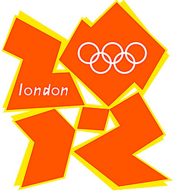
3.Terrible London Olympics 2012 logo fail
When London Olympics 2012 logo was released it was immediately criticized by the people but still it was not changed and used through out the Olympics. If you are still wondering what's wrong with this logo then think again and keep The Simpsons in your mind. Yes, you are right, the BJ!!
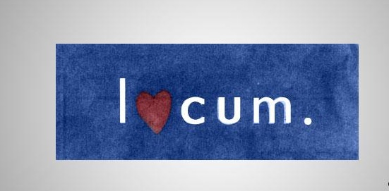
4.Locum logo gone terribly wrong...
Locum is a Swedish property management company. But the logo speaks something different. It must be designed by female in our opinion if it means what it's depicting to be. We recommend you to keep away from such logo designers
5.Clinica Dental Logo fail
Clinica Dental Logo does not look wrong to people who visit dentist very often but a person who has never been to dentist would definitely point out what's wrong with the logo, the logo clearly speaks for position its meant to be, looks like the logo maker was in a good mood when he/she was designing it ;)
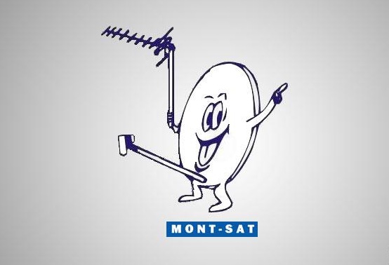
6.Hilarious Mon-Sat logo.
This Man-Sat logo does not require you to be intelligent, even a retard person can point out what's wrong with this logo, The logo clearly depicts the dish Antenna as the D, and looks like the dish is very happy on getting that hard. Some logo designers just want to troll the world in my opinion.
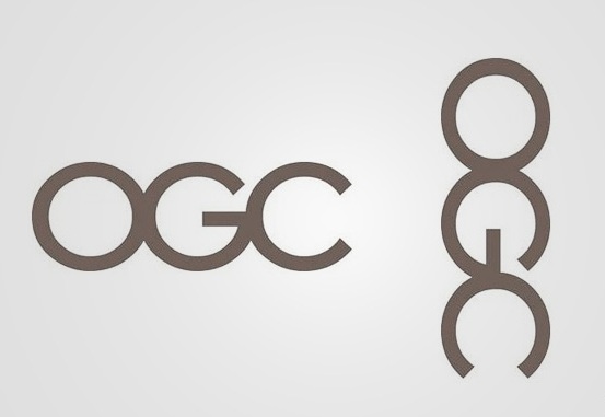
7.How Office of Government Commerce logo vertically
Office of Government Commerce logo is actually a simple logo and no normal human can ever guess what it means till he has a really creative mind. It looks simple when seen by normally but if you ever tilt your head on left shoulder you must have seen the weird thing with the logo. It looks like a guy with his d in hand...
Loading...
8.Catholic church's Archdiocesan Youth commission logo gone wrong
This is an actual logo of the Catholic church's Archdiocesan Youth commission back in 1973.
We understand that people at that time were simple and positive minded but did no one ever notice what's terribly wrong with that logo? This makes me feel that how retarded people are...
9.Arlington Pediatric Center logo is disgusting
Well, in the ranking of logo fails this is one disgusting logo fails i have ever seen, the guy who made this must have Pedophilia but then again it's just our perspective may be he/ she was trying something better.
I hope logo designers take extreme care on what they are trying to symbolize by their logos.
Loading...
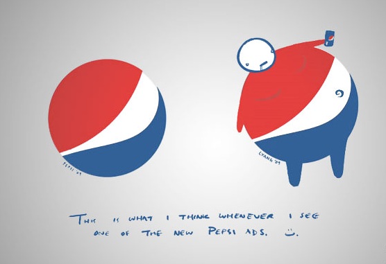
10.Pepsi logo gone wrong!
Well, for this one i would not actually say it's a fail or wrong but rather suitable logo, seeing what junk food does. We think someone must have pointed out this and that's why they changed it long back but it still made some sense, isn't it?
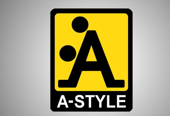
11.A-style Logo gone fail
If you have ever seen A-style logo and you have a logical mind then you must have said this"Go home logo, you're drunk". Well, yes the A-style logo is something which comes first in the category of fail logos, i wonder what style they were actually referring too(if you know what i mean ;))
Loading...
12.Chinese Restaurant
What did you see first?
1. Is Sun rising from the back of a building? 2. A giant yellow colored dildo kind of a thing in the butt of a woman?
Based on what we have seen, we think this logo is a fail!

13.The Computer Doctors Make Things Work For You!
That's a penis!!! It will not look like a computer mouse at all unless you have the cleanest possible mind in the world. That wire at the end of the mouse in the picture just made things more awkward. Let's hope the computer doctors changed their logo.


14.This Bureau Of Health Promotion Logo
This logo looks awkward even if the Bureau of Health Promotion actually deals with sex education or sexual health. No organization should promote threesome! Well, there you go, this is yet another terrifying logo fail.


15.This State Of Vermont Pure Maple Syrup Logo
The Vermont State map looks like a man standing and peeing into a red bucket. You don't really need a dirty mind to find this picture ridiculously silly and hilarious. Well, the logo is truly screwed up.

Report
Loading...
Related Content


