Most Creative McDonald's Ads
Saturday, Aug 22, 2020, 9:00 am
Loading...
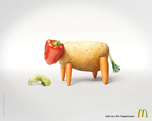
1.Fresh Vegetables
To show that McDonald's only uses fresh vegetables in their sandwich and cows, of course, they made a cow out of a potato, making his legs out of carrots, his face out of a red bell pepper, and his tail out of a piece of lettuce. Gets the message across, doesn't it?
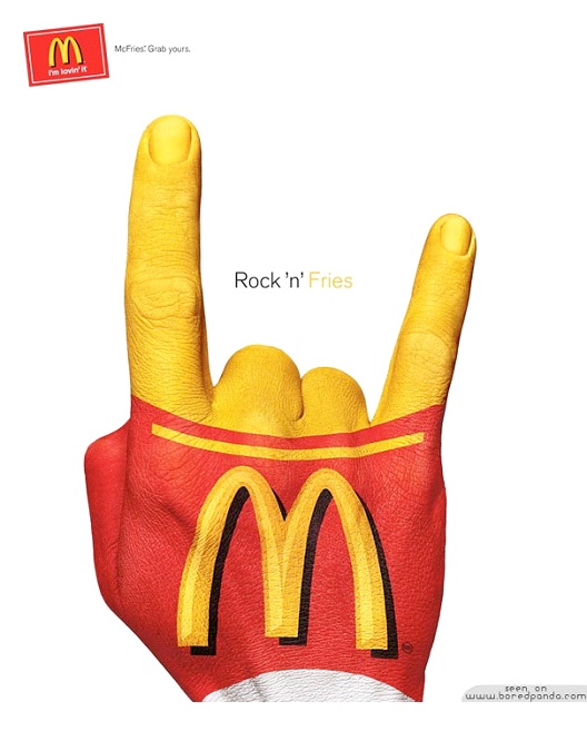
2.Rockin' Fries
This ad is cool and hip, appealing to a younger crowd. McDonald's really knows how to capture the demographics that they are targeting. Rockin' fries is what every teenager wants. Using the yellow on the fingers in a peace sign is a great way to incorporate the arches into the ad.
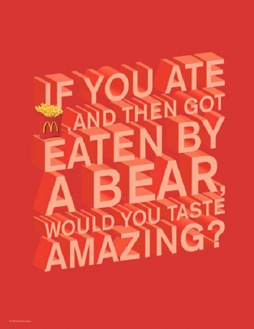
3.You're The Big Tasty
Well, they say, you are what you eat. So then it would make sense that if you ate something tasty, then you would be tasty. So the ad is basically saying that you would taste good to a bear if you ate McDonald's before he ate you. Would you even want to find out the answer to that question?
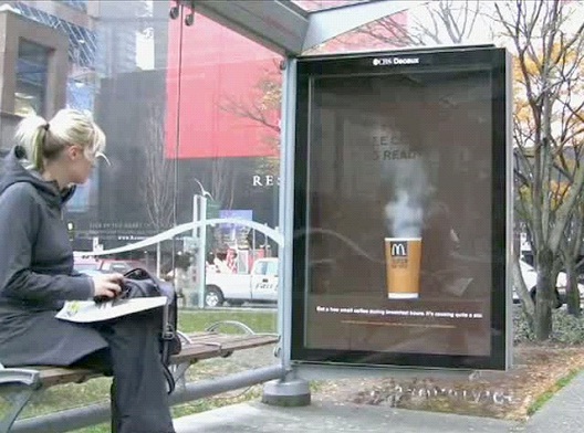
4.Steamy Hot
This ad looks so lifelike it's hard to believe it's not real. The coffee really looks to be hot as the steam rises from the McDonald's cup. Even this girl in the picture is staring, her mouth open and ready for a nice hot cup of McDonald's coffee. On a cold day, this ad is sure to entice.
5.Coffee Pole
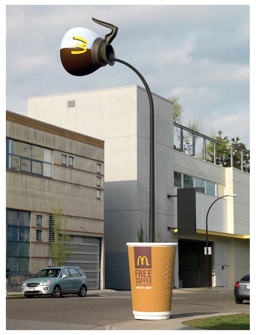
This coffee pole is amazing. Right on the corner is a large cup that says, "free coffee" and a pot is high above pouring the fake coffee into the cup. The giant "M" tells you it's McDonald's and you better hurry, because there's going to be a stampede as everyone charges in for their free coffee.
6.Really Fresh
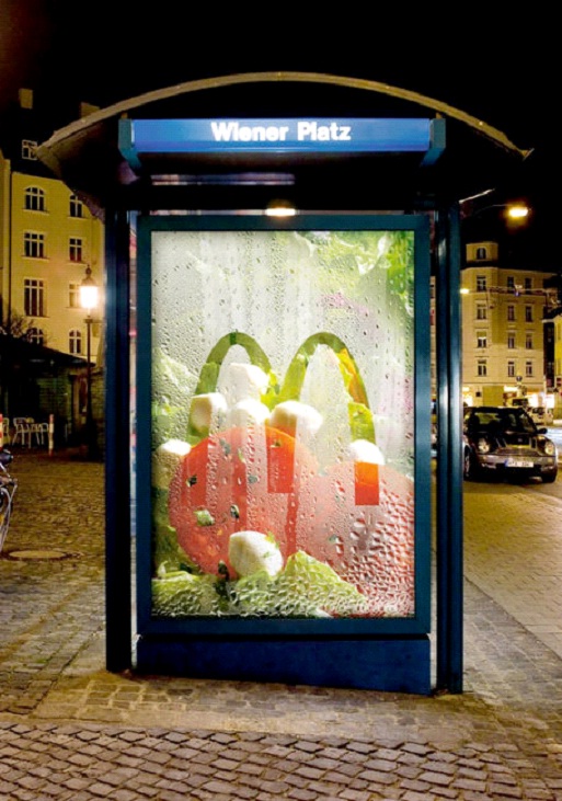
The fake condensation on this glass ad makes McDonald's ingredients look as fresh as can be. Behind the glass is the lettuce and tomatoes that are used in their sandwiches, making our mouths water for the crispy goodness mixed with a steamy hot burger. Add some cheese and sauce and it's a delicious meal.
7.Fish Out of Water
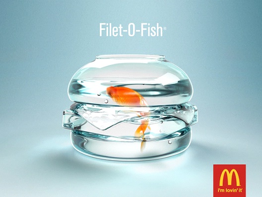
This ad is perfect. A fish in a bowl made to look like the Filet-O-Fish sandwich at McDonald's. A favorite that has been around for a long, long time, it's still a best seller for the burger giant. The perfect blend of fried fish, cheese and their special tartar sauce, between two buns.
Loading...
8.Growing Up On McDonalds
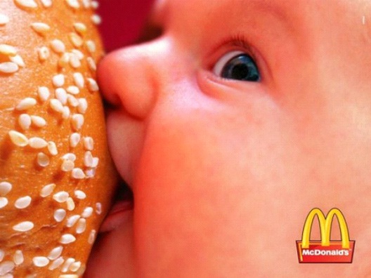
This ad is a little risque but really gets the message out there. Most of us have grown up on McDonald's and so are our children. By drinking our milk they are already eating there, but then as soon as they get those first teeth, what do they want? McDonald's french fries.
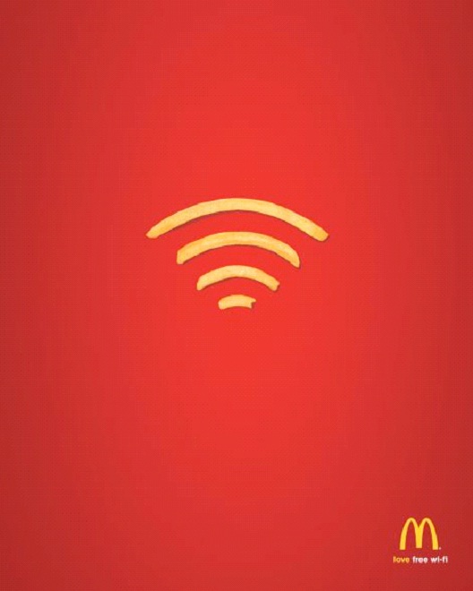
9.Connected
This is a simple ad that really gets the message across. Free Wi-Fi at McDonalds. That's a great way to get your customers in and to keep there for long hours, making them hungry and wanting to buy more burgers, fries and shakes. Genius advertising, genius concept for a burger joint.
Loading...
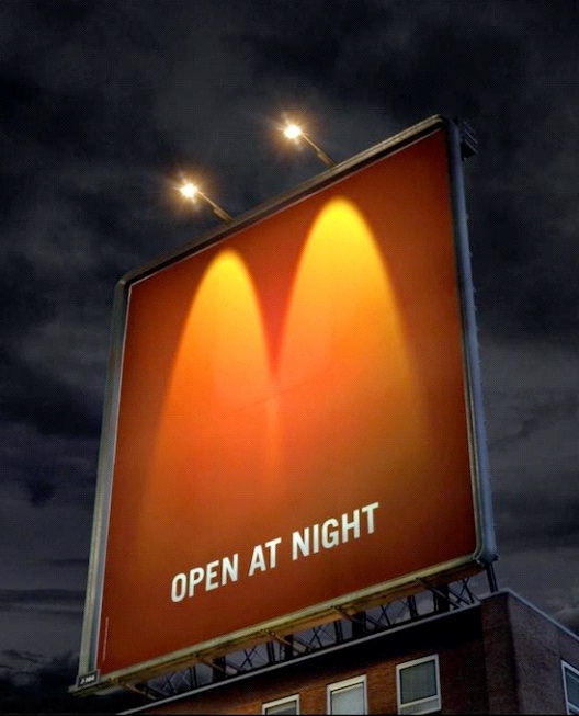
10.Open At Night
A brilliant way to show that McDonald's is open at night. Using the famous yellow arches as glowing lights to brighten up the night sky, everyone know what this means. Notice the sign doesn't even have to say the word McDonald's, just the arches is enough. They are as famous as their burgers.
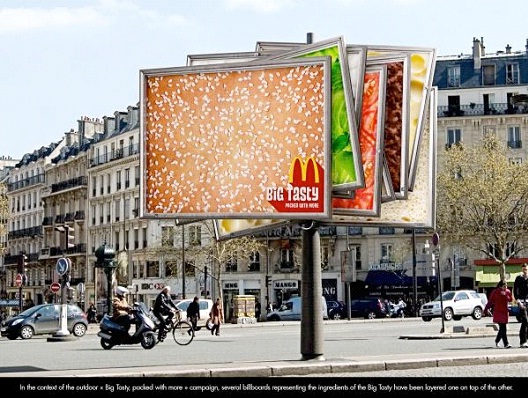
11.Big Tasty Billboard Sandwich
This clever ad for McDonald's uses the billboard itself as all the components of the Big Tasty sandwich. You've got the bun front and center, and then the lettuce, onion, tomato, cheese, the beef and the sauce. It looks good enough to eat and really gets the mouth watering, that's for sure.
Loading...
Report
Loading...
Related Content

