15 Maps That Will Change The Way You See The World
Monday, Aug 17, 2020, 9:34 pm
By:James Fraser
Loading...
The last time when you saw a world map or atlas, you probably were in your high school. What are maps used for? Locate continents, countries, oceans etc? If you say yes, you are wrong! Maps are generally used to show a ton of useful information, which can be easily understood. Here are fifteen such maps that will change the way you see this world.
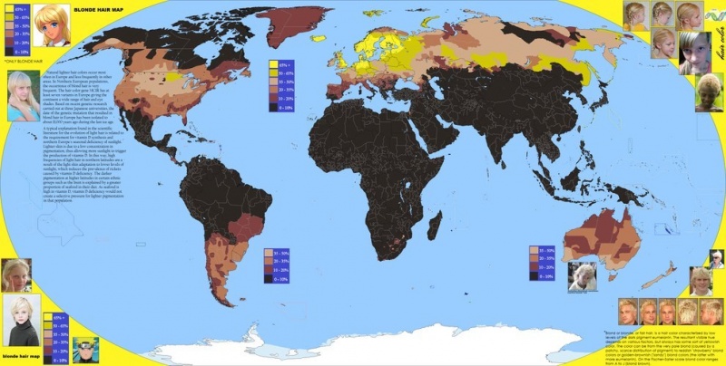
1.Blonde Hair Map
Have you ever wondered where in the world you can find blondes? It is pretty obvious that countries with more white population will have higher number of blondes. This map will give you an idea on spread of blondes around the world. You can also check the average hair color of different people living in different countries.

2.World Map Showing Cities with More than 100,000 Population
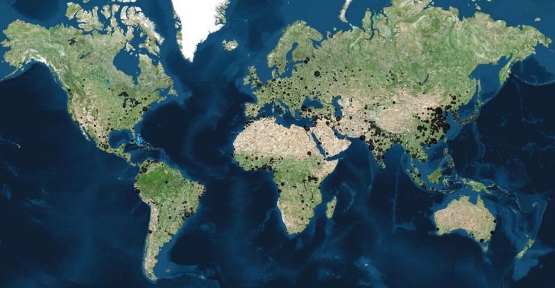
This is another interesting world map. Here, you can see different cities around the world that has more than 100,000 population. The bigger the black circle is, the more the population the city has. If you can't identify cities in this map, you can refer Google maps or a world map that has cities listed on it.

3.Map that Shows Population Density
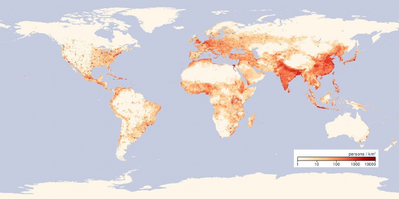
Population density is a measurement of number of people living in a square kilometer of area. This map shows you countries with highest population density. As you can clearly see, China and India tops the world in terms of population density, while parts of Russia, Africa and Canada have the lowest population density. Approximately, 40% of the world population lives in China and India.

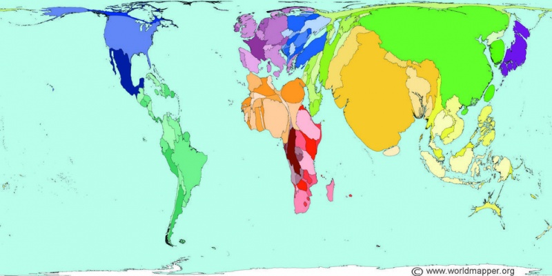
4.Country Sizes If They Were in Proportion with Their Population
Russia is the biggest country in the world. However, it will rank very low when comes to population. Bangladesh is a small country, but has more population than Russia. This illustrative map helps you understand what the size of a country would be like if it is in proportion with its population. Clearly, China and India occupied big space, and rest of the countries looks deflated.

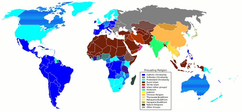
5.Religions around the World
Maps are cool because they help you understand many things in a flash. Besides general idea, if you want to clearly know how religions are distributed around the world, you can check this map. It would probably take a minute or two to learn from this map, whereas you need to read a full page script to understand same.

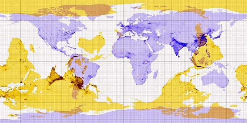
6.This Map Will Answer That Curious Question
We all have this doubt! This map will help you in getting your question answered! This map will show you where you are likely to end up at the other side of the world when you dig a hole at the place you are now. There are many other interactive apps available on internet if you would like to try.

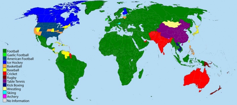
7.Countries and Their Favorite Sports
This is yet another cool and interesting map. This map will help you learn many new and unknown things today. What sport is popular in Australia? Yes, cricket! Similarly, you can find favorite sports of different countries. This map may not be fully accurate, but good enough to give you a general idea.

Loading...
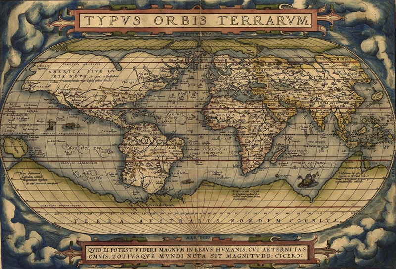
8.This Map is Considered as First Modern Atlas
This map that was made in 1564 by Abraham Ortelius is considered as first modern atlas. There were many atlases that were in use before, but none of them were as accurate as Ortelius's. However, this map might not be as accurate as our present day maps. Remember, this map was developed in those days when there were no satellites or technology.

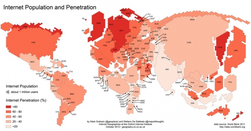
9.Map Showing Internet Penetration Around the World
This map will give you a clear picture on how many people have access to internet. Even in countries like US, there is a good 15 to 20 percent of population that doesn't or can't use internet. Less than two percent of population uses internet in countries like Myanmar, Somalia, Nigeria etc.

Loading...
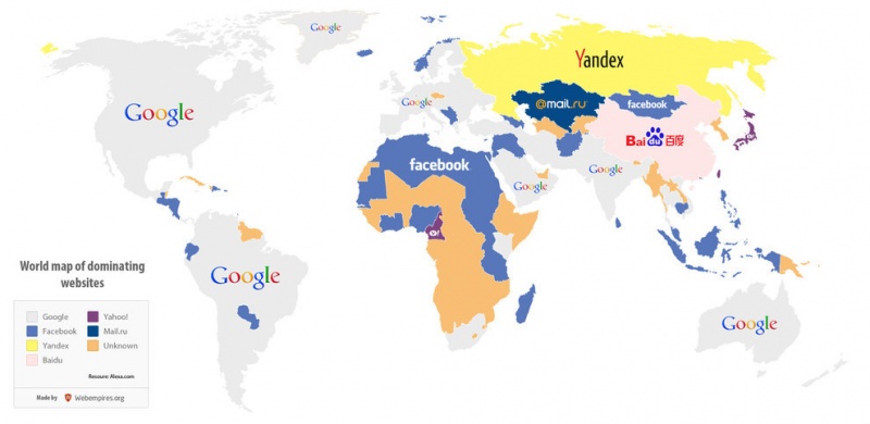
10.Countries and Their Favorite Websites
This illustrative world map helps you understand countries and their favorite/most used websites. As you can see, Google and Facebook are clearly dominating. Baidu is a popular website in China, while Yandex is popular in Russia. In China, almost all popular websites like Facebook, Youtube, and Twitter are banned.

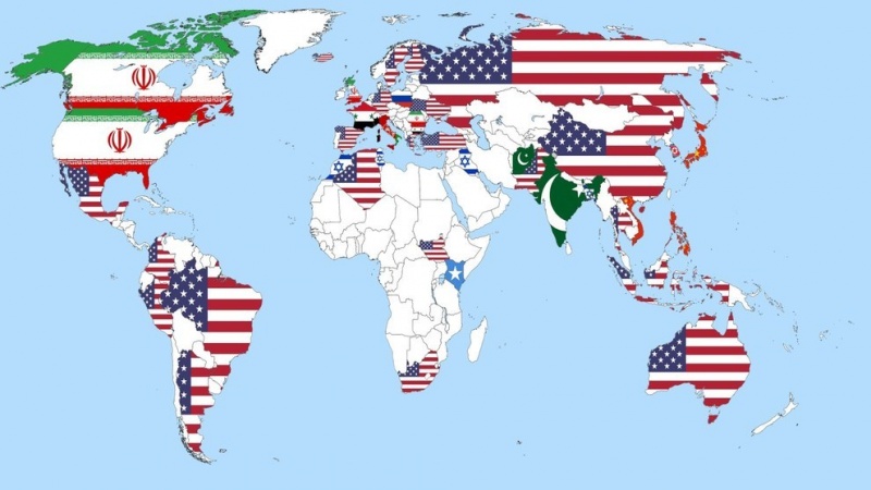
11.This is How Different Countries Think Who is the Threat to World Peace
Do you notice too many US flags in this map? There is nothing to cheer about! According to a survey in which people from different countries were asked 'which country is the biggest threat to world peace?' they responded like this. Countries including China, Australia and Russia think US is biggest threat to world peace!

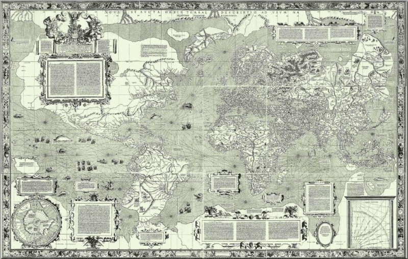
12.The Mercator Projection, 1569
This was a popular map used by sailors in 15th century. The Mercator projection is a cylindrical map projection presented by the Flemish geographer and cartographer Gerardus Mercator in 1569. It became the standard map projection for nautical purposes because of its ability to represent lines of constant course, known as rhumb lines or loxodromes, as straight segments that conserve the angles with the meridians.

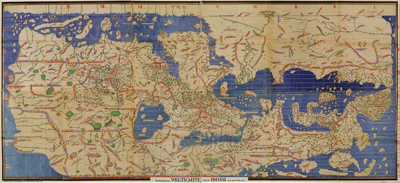
13.World Map by Muhammad Al-Idrisi
Muhammed Al-Idrisi was a geographer and cartographer, who used to be at the court of King Roger II of Sicily. The Tabula Rogeriana, drawn by al-Idrisi for Roger II of Sicily in 1154, one of the most advanced ancient world maps. Modern consolidation, created from the 70 double-page spreads of the original atlas.

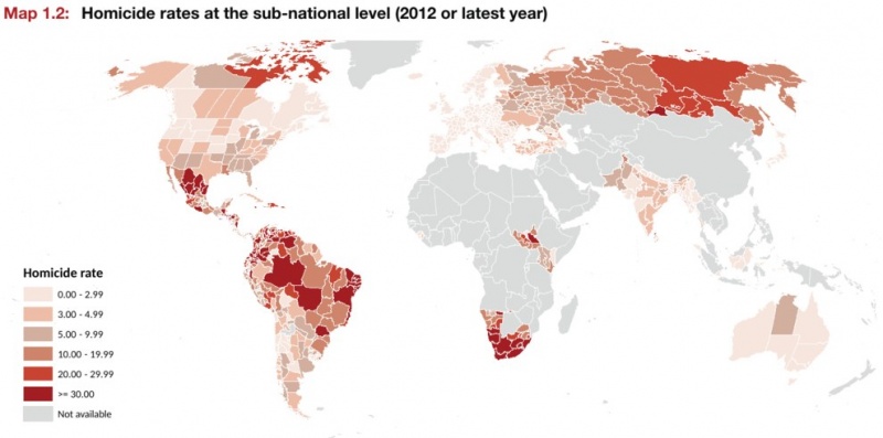
14.Map Showing Homicide Rates around Different Parts of the World
Homicide (murder) rate is very high in some countries, where as it's very low or zero in other countries. This map shows homicide rate in different countries and states within countries. The colors here indicate number of homicides per year per 100,000 of people. The homicide rate is very high in parts of Russia, South Africa, US and North America.

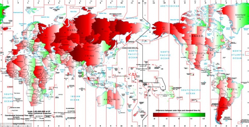
15.Map that Shows Difference Between Solar Time and Standard Time
'Time' is a confusing subject. There are two kinds of times: 1. Solar time and 2. Standard time. Solar time is time sun reaches the particular area, whereas standard time is set by countries. Countries like US has different standard time in different parts of the country. States in eastern part of country get their sun rise 3 hours before western US states. This creates confusion in people while traveling from East to west, unless they are used to it. This map shows difference between solar time and standard time around the world.

While all these maps are little thought provoking, The Maps on this list are actually funny and informative, Did you know how US sees Europe and how Europeans see US? Check out 12 cool maps that you probably never learnt in your school.
Report
Loading...
Related Content


