15 Times Placement Ruined Everything
Monday, Aug 31, 2020, 6:25 pm
By:James Fraser
Loading...
We get to see ads, banners, books, paintings and many similar things every day. However, some of them grab our attention instantly. We stare at them because they look a bit funny, weird or inappropriate for the situation. Sometimes placement can be wrong, and someone times our perspective goes wrong. Either way, hilarious results are guaranteed! Here are fifteen pictures that show us why placement and perspective are important.
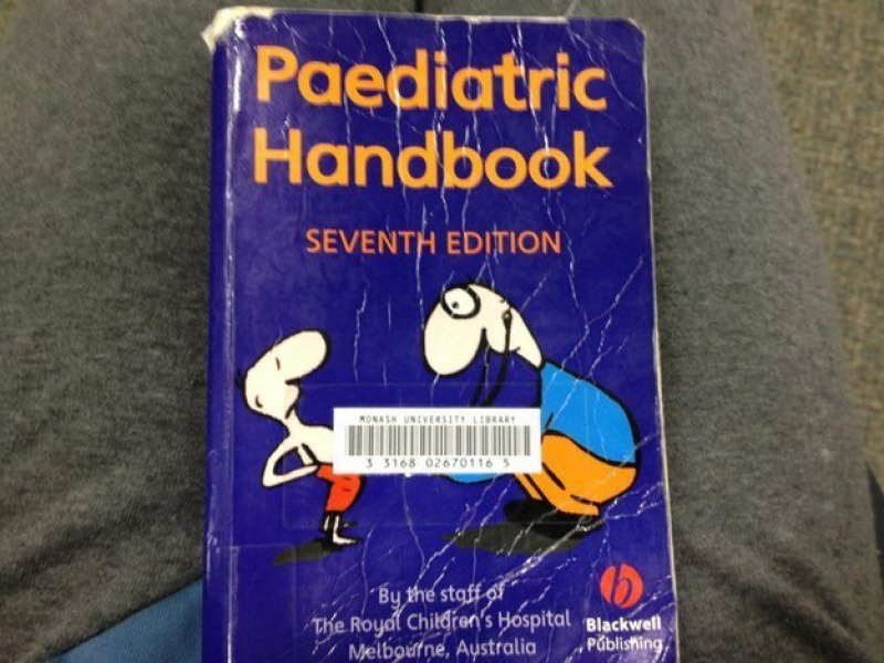
7.This Wrongly Placed Bar Code
That bar code should have been placed anywhere else on the book cover, so the cartoon image there doesn't look awkward. Book publishers spend some money on getting their book covers done. They pay artists to draw cartoons and vectors. Publishers or distributors should make sure those images are seen.

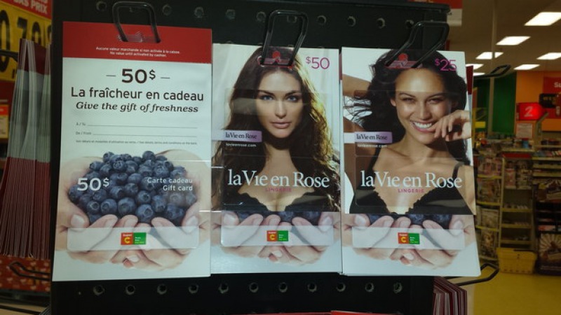
8.Berries and Bras Don't Go Well Together
The women on the two pictures look happy and smiling! If you look closely, the pictures of hands look like they are carefully holding the women's breasts. The items there on the display are bras. The one on the extreme left is a gift card. If the gift card and bras are related, why is there a picture of berries on them?

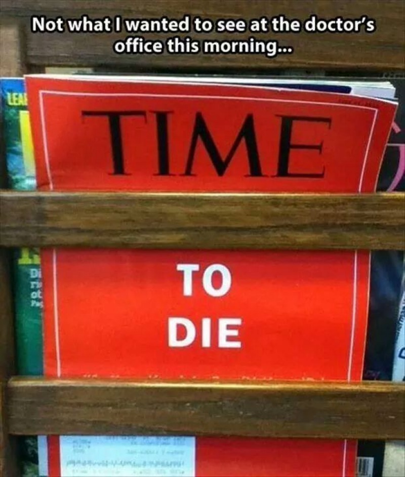
9.The Worst Ever Sentence to Read in a Hospital
It is obviously the worst sentence to read in a doctor's office. And yes, some word was missing there. Can you think of a suitable word that would make the whole sentence sensible, keeping the fact in mind that it was found in a hospital? Ok, let us tell you. The word that gone missing there is HOW. It is a Time Magazine cover that dates back to 2012.

Related Content

