15 Hilarious Logo Fails That Make You Say WTF!
Friday, Aug 28, 2020, 9:44 am
By:
Mike Litzler
A company's or a business's identity is visually expressed through a logo. Imagine all the top firms in the world without logos? It's tough to imagine them, right? We don't deeply observe, but logos and colors impact our mind in a big way. An attractive logo grabs people's attention and helps build a positive impression of the company. So, one should never ever mess up a logo! Check these fifteen hilarious logos fails and understand how people perceive awkward and inappropriate logos and laugh at them.
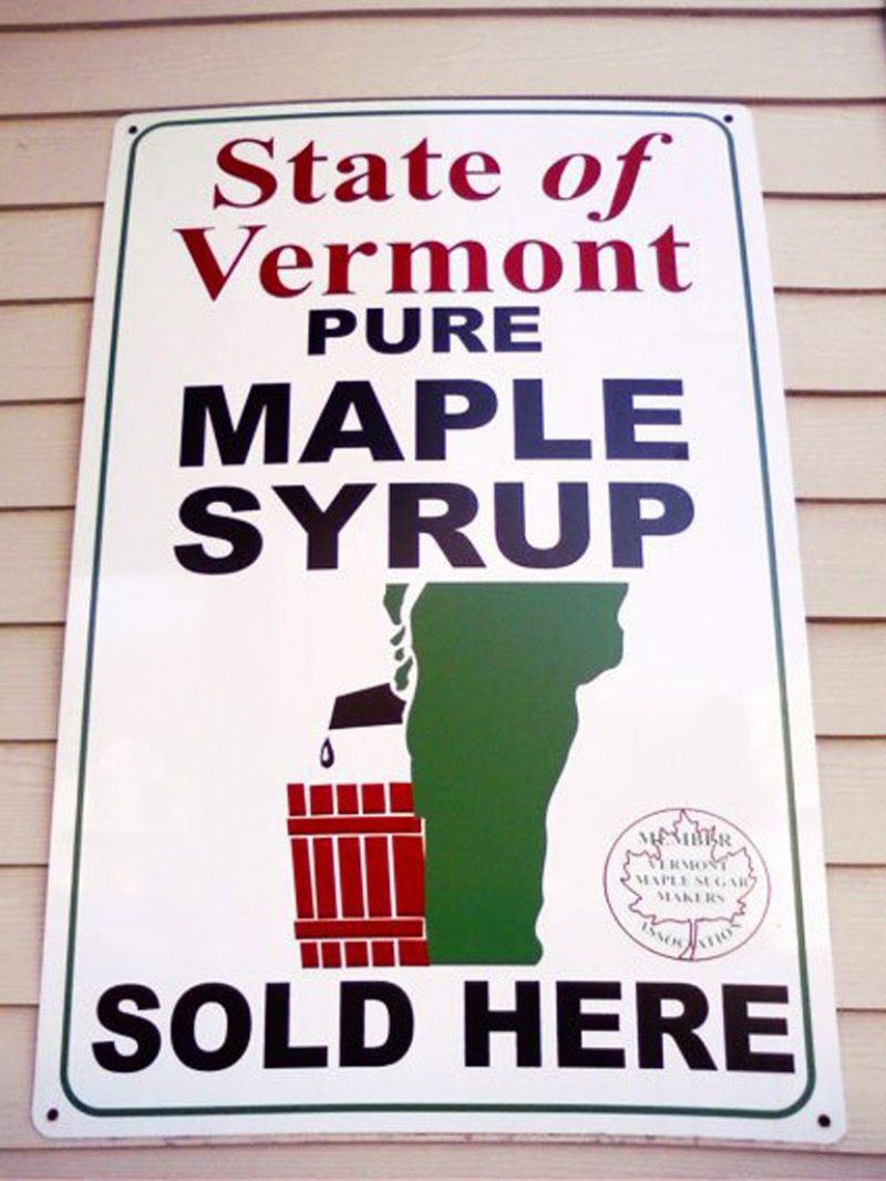
#1 This State Of Vermont Pure Maple Syrup Logo
The Vermont State map looks like a man standing and peeing into a red bucket. You don't really need a dirty mind to find this picture ridiculously silly and hilarious. Well, the logo is truly screwed up.

Loading...
Related Content


